PENNY JUICE

Logo and Packaging Design

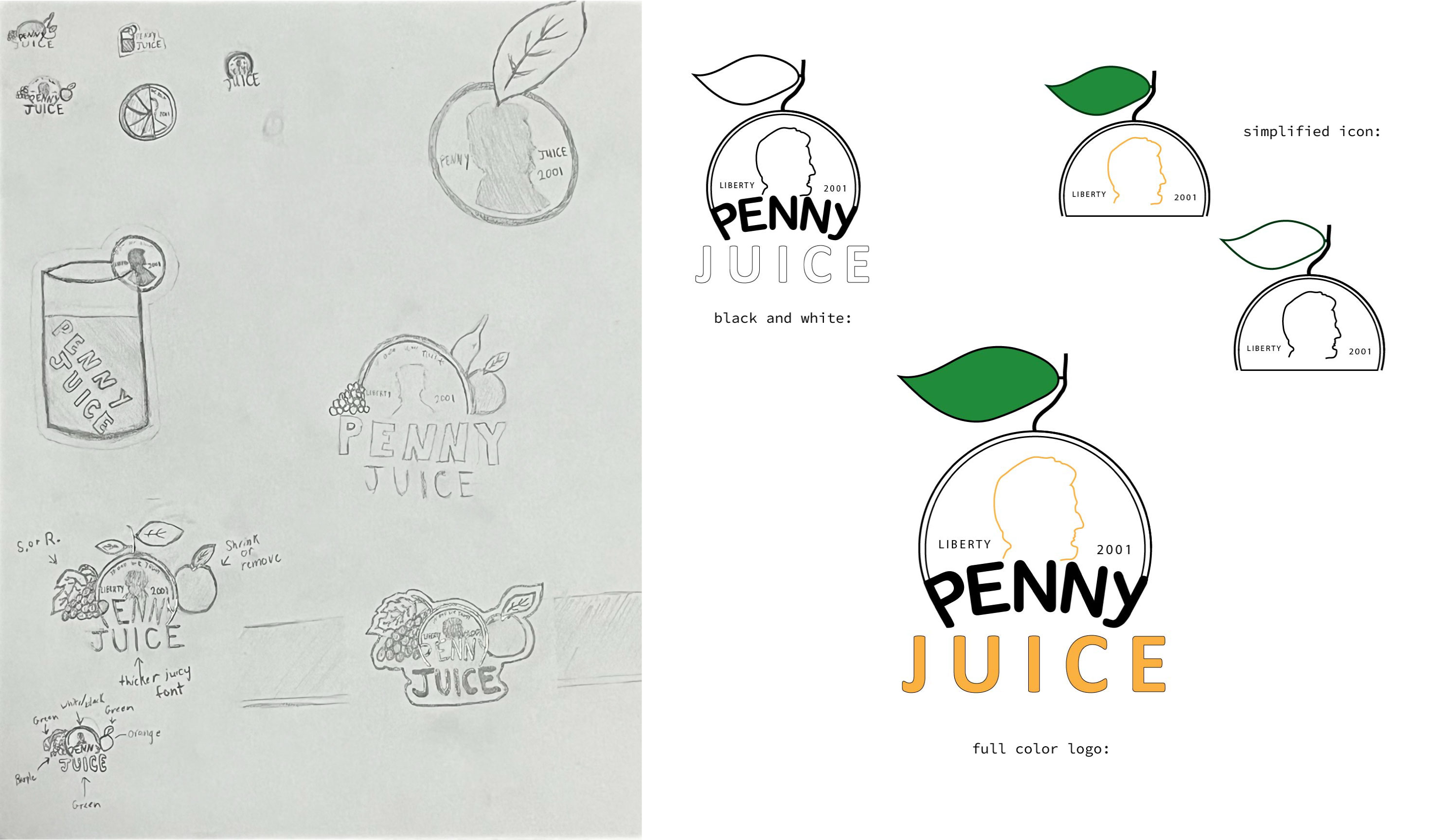
Design Problem: The original logo was very dull and had plain colors which did not give the impression of a drink company. Also the font and colors used was too plain and gave no vibe of being a kid-friendly brand. Most of the branding for me looked to be as if it were some sort of medicine company.

Design Solution: My logo design I wanted to create something that was more recognizable and unique while also improving the look of the logo to appear to be more kid-friendly and juice like. I felt it was important to keep the identity of the penny included in the logo as to me it helped the logo be more unique from other juice brands, at the same time the original penny in the logo felt dirty and did not represent a fruit juice company well so I took the direction of turning the penny half into a fruit in the design.

Audience: Childcare Facilities, Parents & Children

Software: Adobe Illustrator

    Design Process:

  • With this logo I wanted to create something that was more recognizable and unique, whereas the original logo always felt super plain and not pleasing to look at to me. So first I wanted to incorporate the penny somehow into the logo as I felt like it gave the brand an identity and helped it to stand out from other drink companies.
  • So, I sketched multiple different ideas and ran a couple different directions before ultimately landing on the final path that I chose. Some of my first few ideas were busier and involved more fruits in the logo, but after receiving some advice to simplify the logo, I ended up leaning towards using the penny to look like a fruit by adding the leaf and some color and removing the other fruits from the main logo.
  • Another important aspect was the molding of the word penny to fit and shape into the penny design, the intention for this was to get rid of some of the busyness of the penny and by doing my design I was able to cut off basically half the penny and turn the word penny into part of the penny design which I think helped with that cleaner look goal.
  • The leaf was a major steppingstone for me, it took awhile to find a leaf design that really sat well with me. For some reason each leaf I made just seemed to be off, part of my problem may have been it was a bit too big and slightly too bus as well, so I decided to angle the leaf more off of a stem and also removed some of the detail in the leaf which I felt improved the flow of the logo.
  • Font choice was focused on heavily as well, I pondered multiple different directions I could have gone, for example I thought about going more sleek business looking and then I also seriously considered a font that was very juicy looking and plump. After sitting on that font style for a bit I began to change my mind and wanted to lean towards a font that still felt playful and juicy but also looked a bit more professional.
  • Lastly, colors were a big concern, I wanted to use good looking colors that would help give the logo the fruit look as well. I played around with multiple different combos to try and see what sat the best for me, but I also had the intentions this whole time to design the logo so that I could make it look like multiple different fruits or flavors just by changing the color and not anything else on the logo.

pjcolors
company card bag with logo