- The reason I chose my topic (Colors in Branding) was because I have always found it interesting and fun thinking about each brands' logos and what colors they used to make them and wondering what they could mean or why they would choose them.
- Starting this assignment, I researched some other infographics of the same information to give inspiration for what kind of designs were out there and how others made an infographic on this same topic. So, I looked around and picked out a couple aspects of each that I really liked.
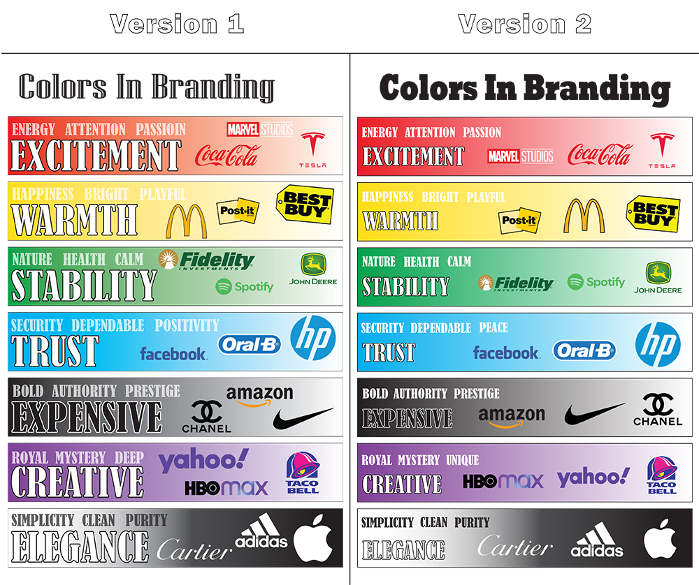
- After that, I used the information I had learned to come up with 3 sketches of possible ideas which I then picked my favorite idea after looking at all three upon completion.
- I then researched a bit more on colors and what meaning they may hold, specifically when used in logos. Using that information I came up with the main word I felt best described each color and put those words as the biggest and most noticeable, then I picked out 3 more words to also use but they would be more greyed out and less noticeable but I felt that it helped give more information without adding to much clutter.
- Lastly, I added each color and made it gradient to again go for a cleaner and less cluttered kind of look, then for each color I picked out 3 companies to represent their logos color.
- During our peer critiquing portion I recieved suggestions that talked about organzing the company logos better so they don't appear to be so jumbled up, also some criticized my font saying it was a bit too large and lastly I recieved corrections over a mispelled word and also a couple suggestions of words that could be switched out for potentially more fitting words.
- Using these suggestions I went immedietly into testing different font sizes and logo placements to achive a more uniform and put together look. After that I cleaned up some of my fonts and words choices to options I belived were more fitting, ultimately ending up with my updated version of the infographic.